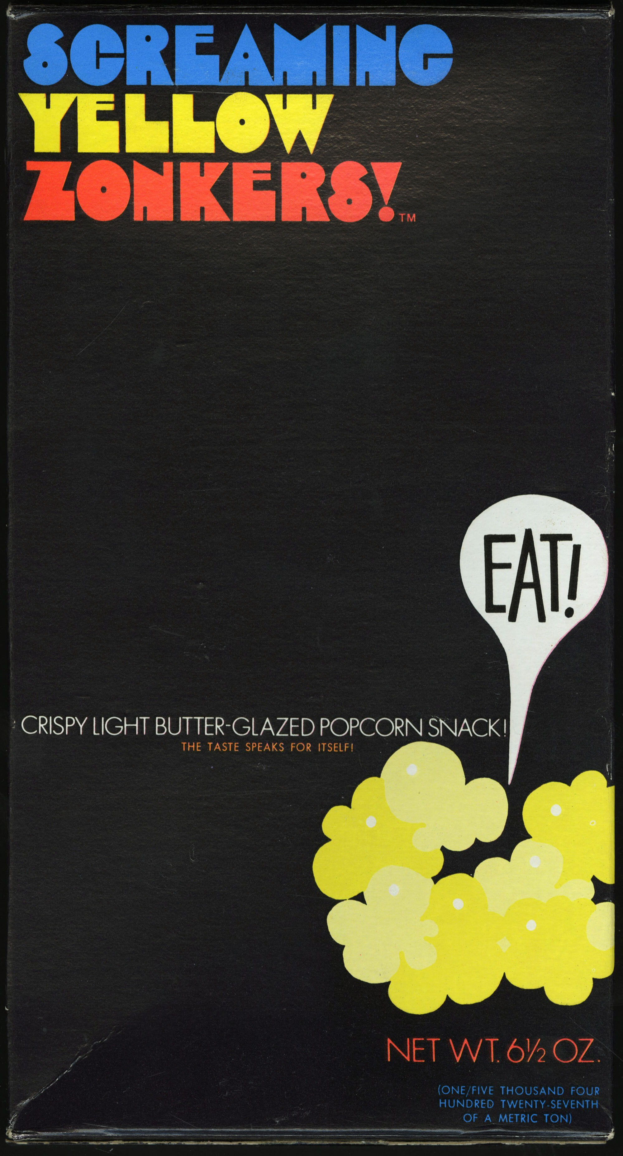
Screaming Yellow Zonkers ☜
I trace my love for graphic design and typography back to my childhood when I would accompany my mother on grocery shopping trips and be struck by visually striking packaging on the store shelves. This box, in particular, designed by Rollin Binzer, made a particularly strong impression on me. It was one of the first times I can recall being consciously aware of the power of a great composition, and I coveted the box for its aesthetic appeal as much as its contents. Lincoln Snacks, c. 1970.
The hero typeface here appears to be a slightly condensed version of Milton Glaser’s classic Babyteeth and I’m very happy to have finally found an official digital (non-condensed) version made available by P22 Type Foundry along with Mr. Glaser before his passing in 2020. You can find it here. P22 has also revived Glaser’s Babyfat, Kitchen, and Houdini.